
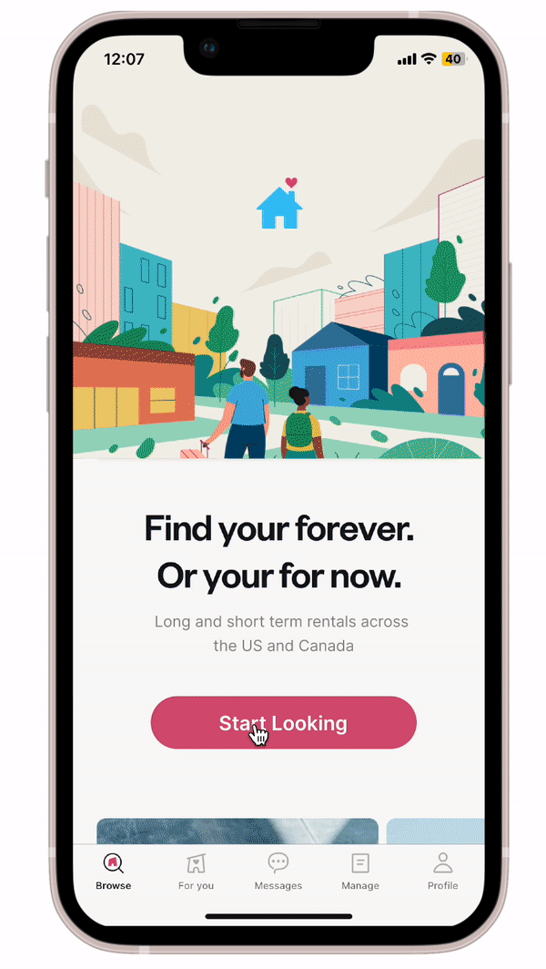
Redesigning
Map UX
For rentals using Zumper
UX Team: JUST MEDURATION: 4 daySMY ROLE: UX DESIGN, UX RESEARCH, PRODUCT STRATEGYProposed solution at a glance
Onboarding - Addition of Map view to allow users to be more precise about where they want to live with
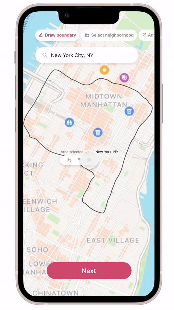
Draw mode - Allows users to draw the boundary within which they want to search.
Neighborhood mode - Allows users to pick specific neighborhoods within a city.
Landmark mode - Allows users to pick places within specific commute times from landmarks.
Discovery - Better interaction between list, map and detail views to allow users to understand location factors.
This solution has been proposed in 3 phases:
Milestone 1 - Low hanging fruit. This phase will have a few parts of the feature that have high impact but extremely low implementation time.
Milestone 2 - Feature with current visuals. All parts of the feature, with little impact on any surrounding features that exist.
Milestone 3 - North star designs. Feature with suggestions to change visuals (and by extension, the app visual design).

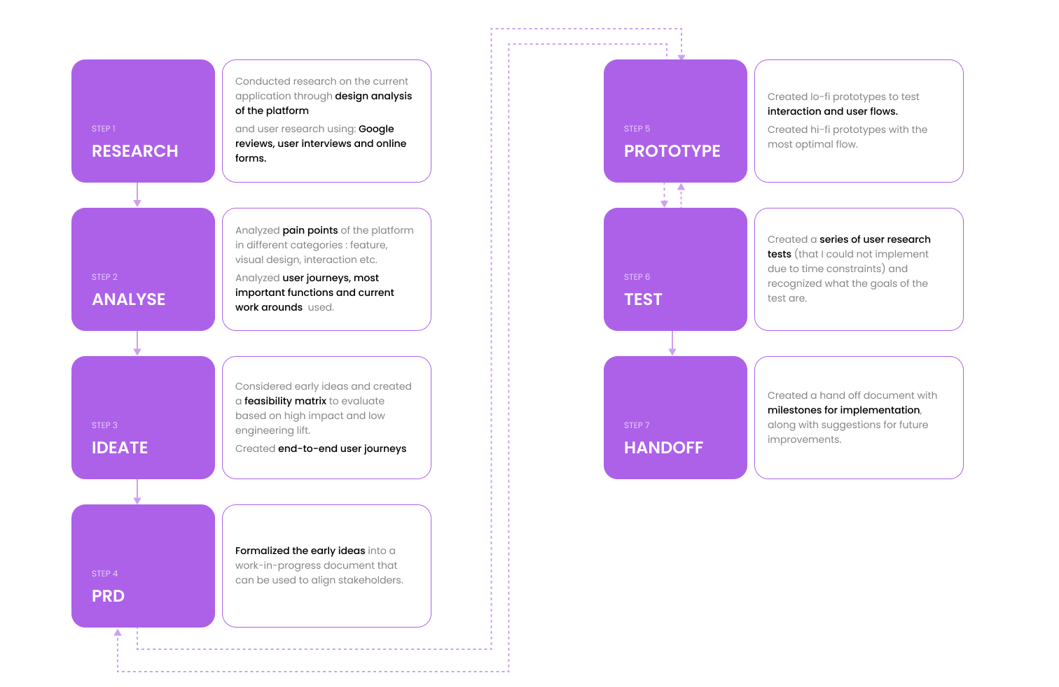
BACKGROUNDDesign Process
While designing, I focused on understanding overall rental user needs, Zumper user needs and pain points. Simultaneously, I focused on understanding Zumper’s app information architecture, design and business needs. While designing, I evaluated high impact solutions on how easily engineering could implement into the current platform.
How can we redesign the Maps experience within Zumper to improve discoverability and ease decision making?
RESEARCHUnderstanding user priorities
I interviewed and polled long term - renters (Zumper or not) using 1:1 research interviews and Google polls to understand what their key decision making criteria were. The results showed that the top 3 factors were:
Location - within which Commute time to work, proximity to entertainment, friends and amenities were important
Budget
Roommates
Since location was by far the most important factor stated by my research pool, focusing on that will have the largest impact.


ANALYZEKey Takeaways - Pain Points
Pain point #1 - Location is the main factor that users consider when renting more than one month. The current onboarding process only uses city and neighborhoods.
Pain point #2 - The current search process does not cover some of the main location factors users consider, like commute times, neighborhood amenities. Users have to go on external platforms to find some of these.
Pain point #3 - Understanding all location factors seamlessly in results page is difficult due to current information architecture and interaction of list view, map view and detail view and where the information lives.
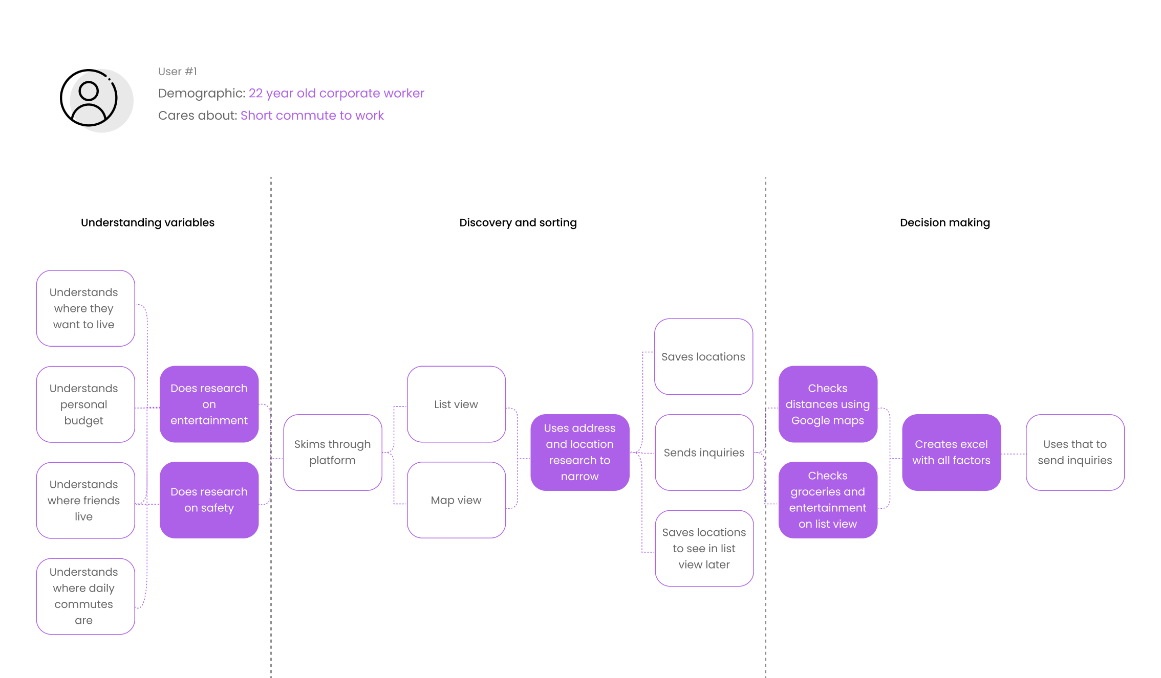
RESEARCHUnderstanding the current user journey
Given the above decision making criteria, I interviewed users to understand what their user journey was using Zumper. The purple boxes marked highly inefficient parts of the journey where users found workarounds (including external platforms) to consider key decision making factors, especially location.
RESEARCHUnderstanding the current platform
I needed to understand WHY the users needed to find workarounds to understand where the areas of inefficiency were on the platform, as well as what the areas of opportunity. I studied the platform to from different angles - visual design, UX writing, areas for feature additions, IA (specifically, how can different parts of the platform be positioned to allow better discoverability).
I focused on the question “Can we give users more location specific information while searching for rentals?”
IDEATEEarly Concepts

IDEATEUser Journeys

prototypeLow Fidelity Prototypes

Addition of Maps in Search stage
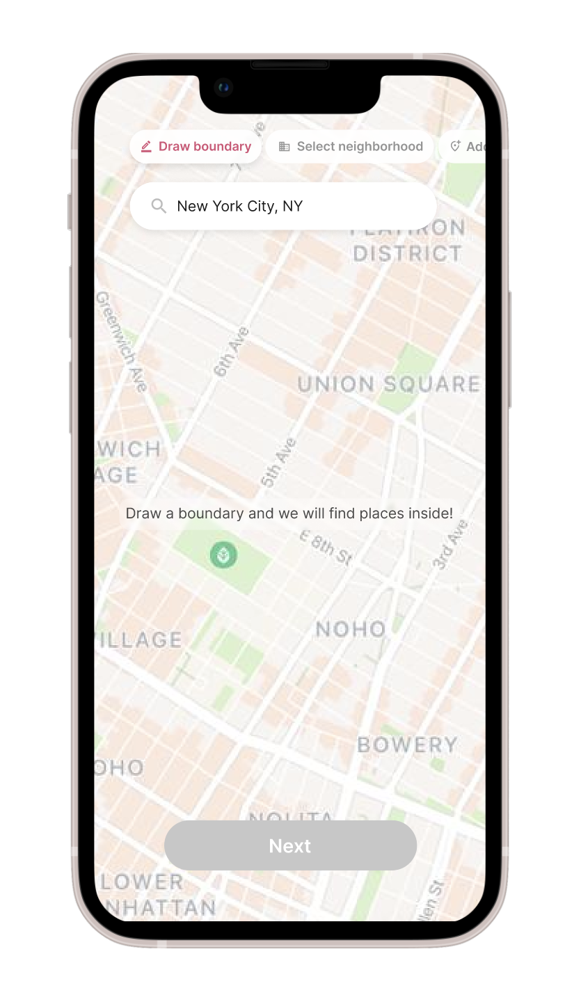
Users can give more precise description of where they want to search for a rental with a “Draw on Map” addition in Search stage

2. Within Search on Maps // Users can manually draw a boundary within which they want to live
Users can give more precise description of where they want to search for a rental with a “Draw on Map” addition in Search stage

3. Within Search on Maps // Users can select neighborhoods or near landmarks
Neighborhoods - while selecting neighborhood, users can see scores like grocery stores, food, nightlife etc. This information lives in another part of Zumper already, but will be useful for users here.
Landmarks - Users can add a pin to places (like their workplace) and find places within a certain commute from them.

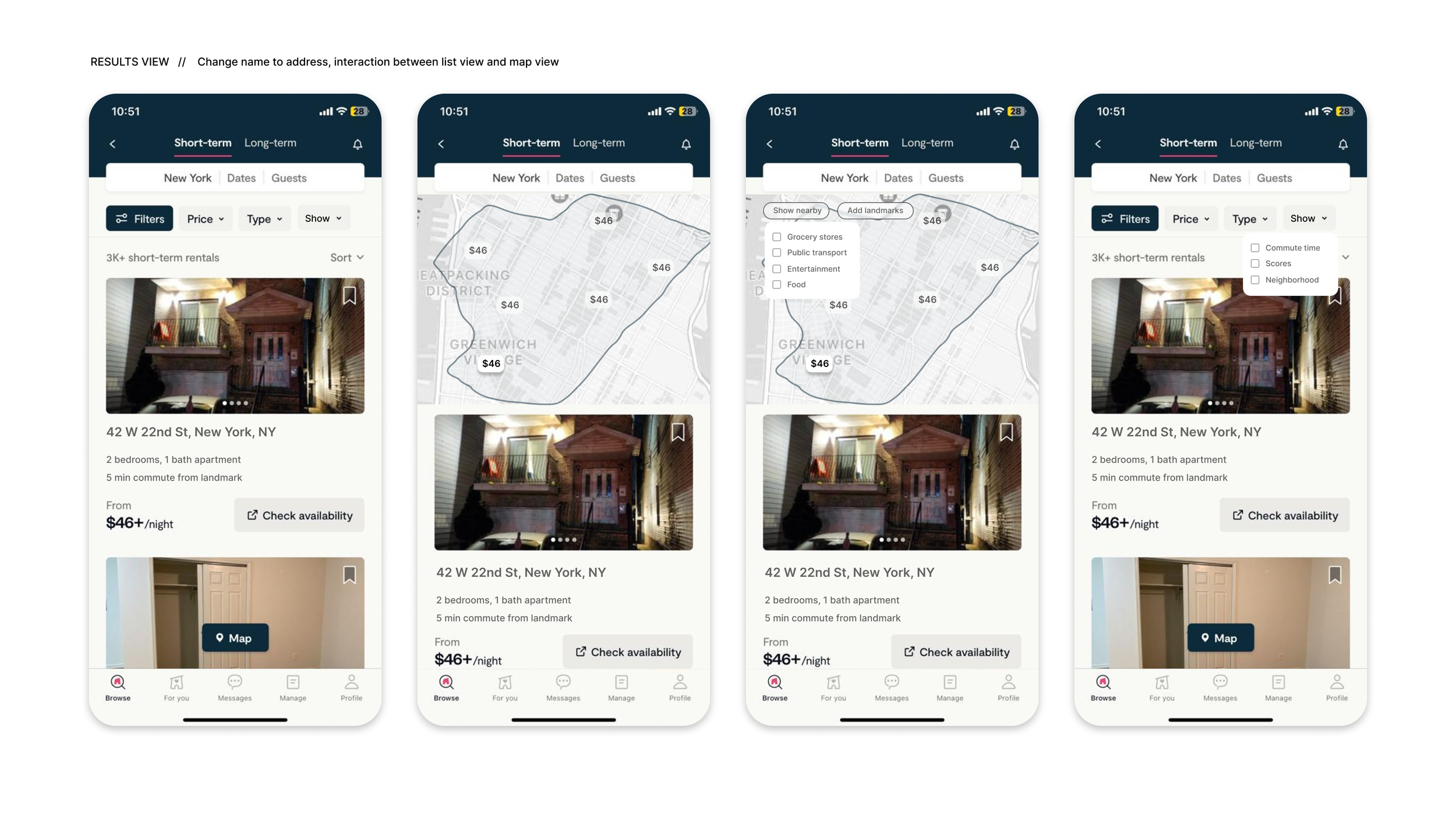
3. Results page // Better interaction between maps and location information with the list view
Information like grocery stores, cafes etc are viewable within maps instead of inside details view. Additionally, users can view info like commute times and neighborhood in the results view. Users can also view list and maps with boundaries simultaneously.
PrototypeLow Fidelity Prototype - explorations


PrototypeHigh Fidelity Prototype - MILESTONE 1
For Milestone 1, features that already exist on Zumper are re-arranged so that users can get location information easily. This is the lowest hanging fruit, with easy implementation and high impact for users.
PrototypeHigh Fidelity Prototype - MILESTONE 2
For Milestone 2, the full feature is built using Zumper’s current visual design. It is also created so that existing features do not have to change to accommodate this.

PrototypeHigh Fidelity Prototype - MILESTONE 3 final
For Milestone 3 North Star design, the main proposal is the introduction of a different primary color for the platform. This is because the current almost-black shade makes it difficult to differentiate titles and tertiary buttons, especially in map view where there are many actions and shades.
The feature set within the Map experience redesign is the same as Milestone 2.
Solving for lack of location precision while searching for housing.
Addition of “Draw on Map” feature which allows users to
Draw manually on map
Select neighborhoods
Add a pin (landmark) to search around
Solving for lack of location precision while searching for housing.
Draw Boundary allows user to manually draw an outline within which search happens. They can also Edit radius of search (as shown in gif). Other options are edit boundary and clear.

Solving for lack of location information like amenities while searching.
Neighborhoods allows users to select specific neighborhoods within the city to search. It also shows information like grocery score, nightlife score etc, that currently live inside the details view of an apartment.
This is information users who are new to an area need while deciding what neighborhood to search within.
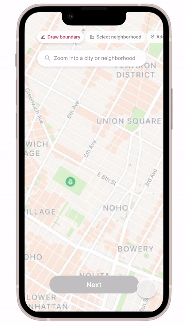
Solving for lack of location information like commute times while searching
Users can manually type or add a pin to specific locations (like their workplace) and find a place a certain commute time away. They are able to change commute time, mode of transport etc.
This was typically informations users found on external platforms.
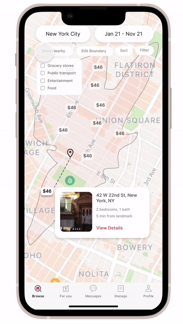
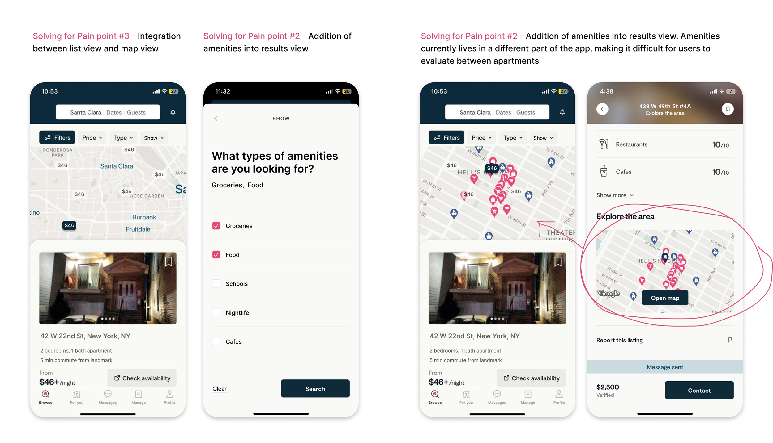
Solving for viewing important location information in results page in maps results
Important information like amenities, nightlife etc can be viewed in results page with other apartments as well, allowing the user to compare easily.
Additionally, Sort options have changed to more be prescriptive like “Sort by shortest commute” instead of “most relevant”.
TestingUser Research Tests
While I did not have the time to implement it myself, my next step would be doing user testing at two levels:
Feature level - user flow, UX writing (do people understand terms like ‘Landmark’?), visual understanding (do people understand the icons used?)
Visual Design - since I am proposing a new interface with a new primary color, I will also want to test whether there is a tangible difference in interaction before engineering takes on a heavy lift. Is there an obvious difference for people to understand between buttons and title text? Is accessibility better? If not, we should stop at Milestone 2.
Solving for viewing important location information in results page.
Combining map and list view allows users to view location information easily with the details in list.
Additionally, names have changed to actual locations, since random titles did not help the user in any way and important info like commute times have surfaced.


next stepsWhat would I do differently if I were doing this at a company?
Team style - I would first understand the team style - what do they need most? Speed? In-depth user studies? More structured and documented work that can be shared for alignment? Based on that information, I would structure my design approach and prioritize some results over others.
Testing - I would spend time on tests. Based on company needs, that could be early user testing before production or design smoke tests if large scale results are needed quickly.
Milestone 3 - I would first discuss Milestone 3 and the visual design change with the design system team and make a case for my proposal. If it is not seen as an improvement by the team/ or if the early numbers do not show results, I would spend a lot more time focusing on Milestone 2.