
TIMELINE
Late 2024
ROLE
Sole 0 -> 1 Designer
PURPOSE
NVIDIA AI Enterprise Team
INTRODUCTION
Role & Impact
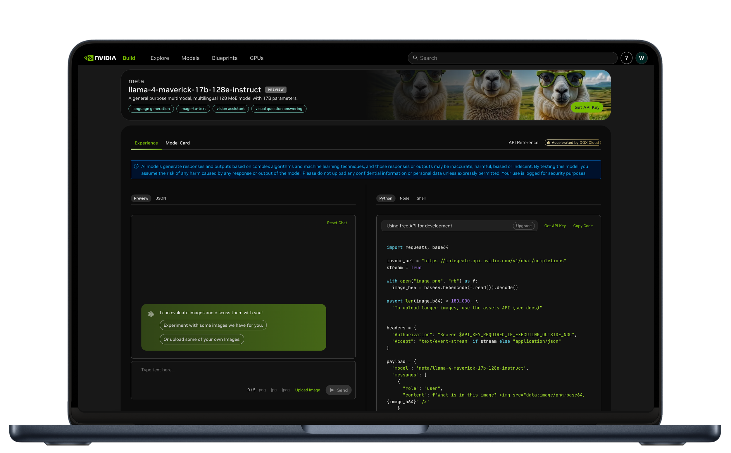
Led end-to-end 0→1 design of the new chat playground experience, being the sole designer for 100% of the designs shown on this page. This playground supports over 70% of all deployed models on the platform, making it the most heavily used interface.
Redesigned the design system to enable a cleaner, more modern UI that aligned with user expectations and platform standards.
Authored the Product Requirements Document (PRD) to align cross-functional teams and clearly define goals, scope, and success metrics for the redesign.
INTRODUCTION
New Chat Interface for build.nvidia.com
The playground on build.nvidia.com was designed to help users test, understand, and deploy APIs by interacting with inputs, editing parameters, and exploring deployment options. While it functions well as an explanation tool, there was a need to declutter the interface.
Older Interface
Visually overwhelming: Excessive use of color, space, and dense content made the interface hard to scan and created unnecessary cognitive load.
Poor alignment with developer workflows: The layout prioritized code visibility over interaction, while developers typically evaluate APIs by testing the experience first.
Low information hierarchy: Key actions were buried within noise, making it difficult for users to focus on what mattered—input/output behavior and deployment pathways.
New Interface
Simplified the layout and visual language: Reduced visual noise by streamlining colors, spacing, and component density to focus user attention on core actions.
Reordered the experience to match developer behavior: Prioritized the interactive experience—chat input/output—before revealing underlying code and deployment details.
Improved hierarchy and clarity: Introduced clear sections and progressive disclosure to guide users through understanding, testing, and deploying the API more intuitively.
INTRODUCTION
Design Goal
The updated API Playground experience aims to address current usability issues and better meet the needs of our key user personas. Our primary objectives are:
Reduce Visual Clutter
Streamline the interface to create a cleaner, more focused experience. This will help users—especially first-time visitors—quickly grasp the API’s core capabilities and benefits without being overwhelmed.
Improve Discoverability & Flow
Make it easy for users to find relevant parameters and understand what each one does. Clearly communicate how the API works, including the full range of possible parameter combinations and their effects.
DESIGN CHANGE 1
Change in Visual Language
Focused Visual Hierarchy: Removed unnecessary colors and graphics to reduce noise and draw attention to primary actions like “Deploy.”
Progressive Disclosure: Simplified the interface to reveal only the most essential step first, reducing decision paralysis for first-time users.

DESIGN CHANGE 2
Minimalist Interaction Surface
Contextual Surfacing of Information: Elements not immediately required—such as advanced settings, API options, and metadata—were hidden or moved behind expandable sections, allowing users to focus solely on the current task.
Step-Oriented Layout: The interface was redesigned to present only what the user needed to complete the next step, minimizing friction and supporting a smooth, linear progression through the API experience.

DESIGN CHANGE 3
New Architecture to match user evaluations
Sequential Evaluation Over Simultaneity: The interface was restructured to prioritize understanding the API experience before diving into implementation details. By presenting a focused preview or demonstration of the API’s functionality upfront, developers can evaluate its relevance and utility before engaging with code snippets or configuration options.
Clarity Through Progressive Disclosure: Rather than presenting all elements—code, settings, and outputs—on a single, cluttered screen, the design now guides the developer through a logical sequence: explore the output first, then access the implementation. This reduces cognitive load and aligns with natural decision-making flow.

DESIGN CHANGE 4
Experience First Design
Prioritized the Demo Experience: The new layout foregrounds the API’s real-world output, aligning with how developers typically evaluate tools—by seeing what they do before digging into how they work. This supports faster decision-making and reduces unnecessary complexity upfront.
Expanded Layout for Feature Visibility: By simplifying the header and moving secondary metadata into collapsible sections, the redesign reclaims valuable vertical space. This allows the demo and advanced features to be presented clearly and progressively, without overwhelming the user.
